Your signup graph looks fine. New trials keep landing, MRR still nudges upward, and the team tells itself the market is healthy. Then renewals slip, support gets quieter, expansion stalls, and the leak becomes obvious only after acquisition has already spent a month patching the hole. That's usually the moment churn analysis stops being a reporting exercise and starts becoming the most important diagnostic in the company.
A common mistake is treating churn like a single number to watch, not a system to investigate. Once you separate logo loss from revenue loss, separate voluntary from involuntary churn, and compare cohorts instead of averages, the problem becomes much more legible. If you want a companion primer on the mechanics, the churn rate prediction guide is a useful adjacent read, and for a plain-language refresher on the business meaning of churn, Creem's explainer on churn meaning is worth skimming too.
Table of Contents
- Why Churn Analysis Matters More Than Acquisition
- The Core Metrics You Need to Track
- Building Cohorts That Reveal Hidden Patterns
- Separating Real Signals from Noisy Proxies
- A Practical Root-Cause Investigation Workflow
- Choosing the Right Tooling for Your Stage
- Turning Findings Into Retention Strategies That Work
Why Churn Analysis Matters More Than Acquisition
A lot of founders can tell you their top-of-funnel numbers without blinking. Fewer can tell you which customer groups stopped renewing three months ago, or which billing issue is turning good intent into avoidable loss. That gap is expensive, because U.S. customer churn costs businesses an estimated $168 billion per year, a 5% decrease in churn can boost revenue by 25–95%, and acquiring a new customer typically costs about six times more than keeping one you already have, according to Qualtrics.
A retention problem can hide behind healthy acquisition for a long time. Marketing keeps filling the bucket, the board sees growth, and nobody notices that the cohort curve is bending the wrong way until the economics get ugly. Churn analysis is the work that turns that vague anxiety into specific diagnosis, so the team can stop blaming “market conditions” and start seeing whether onboarding, pricing, support, billing, or value realization is the issue.
What the analysis is really buying you
Good churn analysis doesn't just tell you who left. It tells you which accounts were always at risk, which accounts were rescued by a process change, and which losses were operational rather than product-related. That distinction matters because the fix is different each time, and a retention motion that ignores the mechanism usually wastes cycles.
A board-level retention conversation needs this level of clarity. You're not asking whether churn exists, you're asking what changed, where it changed, and whether your response altered the outcome. That's also why churn work sits closer to revenue operations than to a generic KPI dashboard.
Practical rule: if acquisition is the headline and retention is the footnote, your dashboard is probably flattering the wrong side of the business.
The right churn workflow gives you a weekly rhythm. It flags weak cohorts early, shows where revenue is leaking, and helps the team decide whether to invest in onboarding, product adoption, or billing recovery. For recurring-revenue businesses, that's not a nice-to-have, it's the difference between growth that compounds and growth that constantly replaces itself.
The Core Metrics You Need to Track
A churn review gets messy fast if the team argues over definitions instead of the numbers. Start with a small set of metrics and label each one clearly. Customer churn rate is usually calculated as customers lost ÷ customers at start × 100, while revenue churn uses the same logic against recurring revenue. Industry guidance also separates logo churn, revenue churn, and net retention Amplitude.
The four metrics that belong on the same page
Logo churn shows how many customer accounts left.Revenue churn shows how much recurring revenue left with them.Gross churn isolates losses before offsets.Net retention shows whether expansion inside existing accounts is covering the losses.
That last distinction is where retention work gets honest. A business can lose accounts and still hold revenue if the remaining customers expand enough, so customer count alone can mislead in B2B. In consumer or freemium products, logo churn often carries more weight because account volume and engagement move together. In enterprise SaaS, revenue churn usually gives leadership the cleaner read.
| Metric | Formula | Best Used For |
|---|---|---|
| Customer churn rate | Customers lost ÷ customers at start × 100 | Tracking account loss in any subscription model |
| Revenue churn rate | Lost recurring revenue ÷ recurring revenue at start × 100 | Understanding financial impact in B2B and SaaS |
| Gross churn | Lost customers or revenue before offsets | Seeing pure loss without expansion masking it |
| Net retention | Retained and expanded revenue compared with starting revenue | Measuring whether existing accounts are growing or shrinking |
Benchmarks help, but only if you treat them as context, not comfort. Amplitude's churn analysis guidance points to established SaaS ranges that often land around a low single-digit annual churn target, and subscription businesses are also commonly compared against monthly churn benchmarks. Use those references to sanity-check your numbers, not to excuse weak retention.
A practical comparison point belongs in the same conversation. If churn analysis is tied to early product value, a guide on how to improve SaaS activation helps connect the first successful user action to later retention. For revenue reporting, ARR meaning is a useful companion because it keeps the recurring revenue conversation grounded in the same operating model.
Building Cohorts That Reveal Hidden Patterns
The headline churn number is a blunt instrument. It blends new customers, old customers, high-intent accounts, bargain hunters, and half-onboarded users into one average, which is exactly how problems stay buried. Cohorts fix that by asking a narrower question, what happened to the same group of customers over time, under the same business conditions?
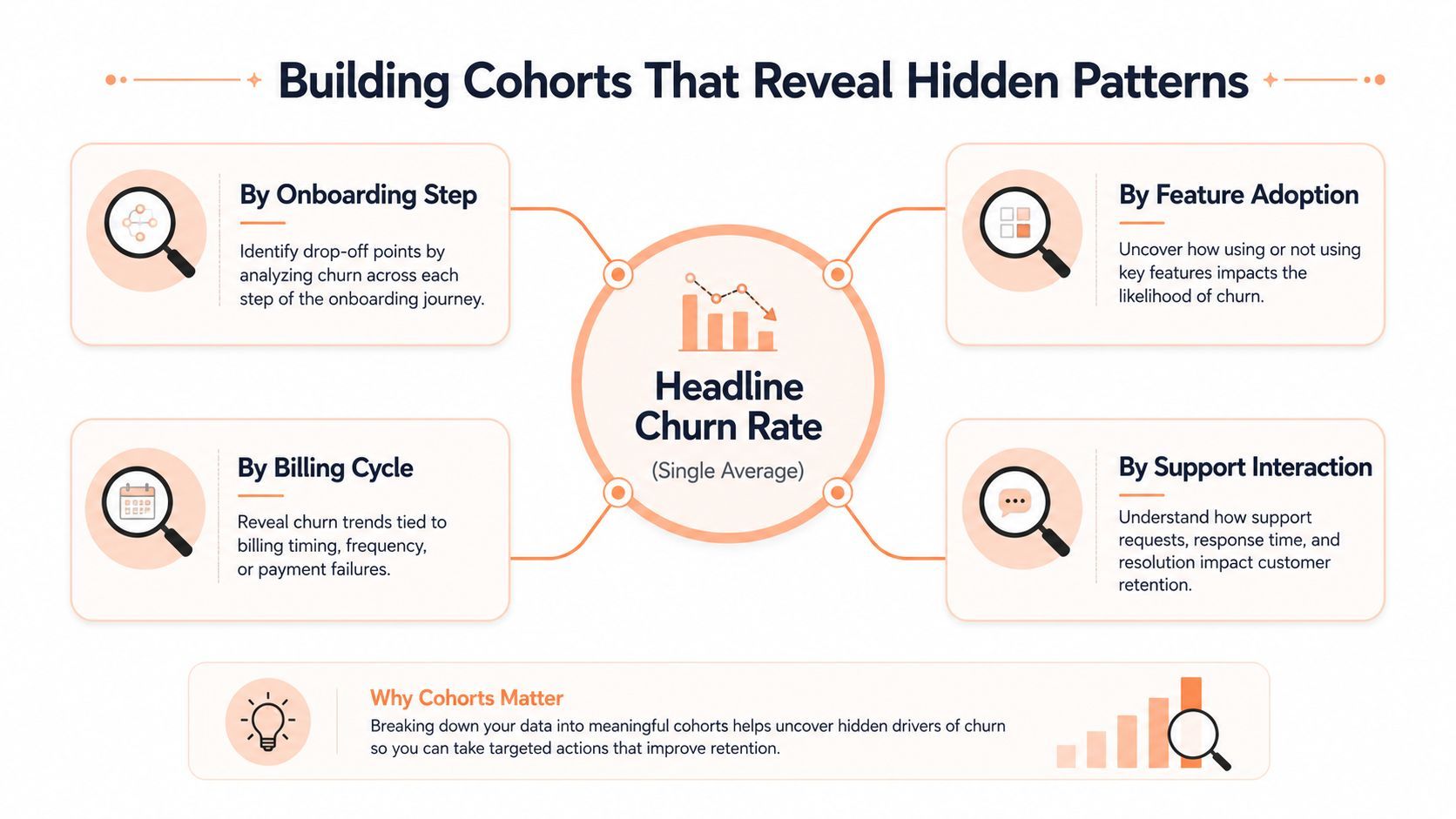
The strongest cohorts are usually built by signup month, plan tier, acquisition channel, or first feature used. Each slice answers a different question. Signup month exposes whether a launch or pricing change affected retention. Channel tells you if the acquisition source is bringing in sticky buyers or one-and-done traffic. First feature used often reveals whether customers who reach a meaningful value moment stay longer than those who don't.
Why fixed windows matter
A cohort only helps if the observation window stays consistent. If you mix periods, churn drivers get washed together and the data looks calmer than it is. A fixed-window view makes time-dependent churn visible, which is why periodic KPI snapshots are so useful for retention work Towards Data Science.
That matters in practice because churn rarely arrives uniformly. A cohort might look healthy at the start, then weaken at renewal, or drop sharply after onboarding and stabilize later. Without a fixed window, the same cohort can look both fine and broken depending on which month you sampled.
The average churn rate is often the least interesting thing in the file.
A good cohort read usually shows one of three patterns. A steep early drop points toward onboarding or product adoption friction. A flatter curve with late decay often points to value erosion or renewal pressure. A “smile” shape, where early loss is followed by a loyal core, usually means the product works for one segment but fails to get a broad enough share of users to first value.
The goal isn't prettier charts. It's exposing the exact slice of the customer base where retention bends, then tracing that bend back to a real operational decision.
Separating Real Signals from Noisy Proxies
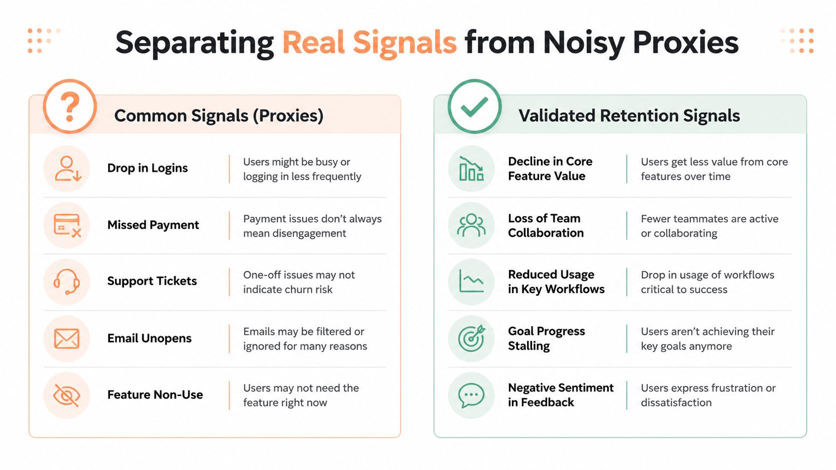
Most retention teams already know the obvious warning signs. Usage dips, unresolved tickets, failed payments, and slower logins all deserve attention. The trap is treating every one of those signals as evidence of causation instead of looking at whether the signal is just a noisy proxy for something else.
Correlation is not enough
A drop in core-feature usage can mean onboarding failed, but it can also mean a customer shifted workflows, paused for seasonal reasons, or lost budget internally. The same support-ticket spike could reflect product confusion, implementation depth, or a temporary burst of edge cases. That's why one source warns against blaming a segment because it contains a large share of churned customers; the segment still has to be compared against the overall base composition to avoid false conclusions Helply.
A common issue with churn dashboards is presenting signals as equally actionable, leading teams to spend weeks chasing noisy alerts. A stronger approach is to ask whether the signal predicts churn in a way you can intervene on, or whether it only tells you that the customer is already changing behavior for reasons you don't control.
A better filter for signals
Use a simple test. If the signal appears, does the customer still have a plausible path back to value? If yes, it may be worth intervention. If not, you're probably seeing a late-stage symptom, not an early warning. That distinction matters because late-stage rescue work is expensive, and it often makes more sense to fix the mechanism upstream.
Practical rule: don't promote a signal to an intervention trigger until you can explain what action should change its outcome.
Some signals deserve attention only when they show up together. A support issue with low feature adoption means something different from the same support issue in a mature account with healthy expansion. Churn analysis becomes causal when you stop asking “what is happening?” and start asking “what would have happened if we changed one thing earlier?”
A Practical Root-Cause Investigation Workflow
The cleanest churn investigations start small. Pull cancellation reasons, exit surveys, support-ticket themes, billing recovery notes, and a handful of product variables that seem most likely to matter. Don't widen the net too early. Teams that try to model every possible feature usually end up with a foggy answer and no clear intervention path.
Build the file, then test the suspects
Label each account by whether it churned by the next observation date, then compare churn rates across deciles or simple cohorts. That “next snapshot” approach is important because it gives you a defensible time boundary instead of a mushy after-the-fact interpretation. It also keeps the analysis aligned with how customers move through the lifecycle, which is why fixed observation windows are more reliable than blended averages Towards Data Science.
The strongest workflow usually looks like this:
- Capture cancellation context: Ask for the reason at exit, but don't trust a single dropdown to tell the whole story.
- Read support themes: Look for repeat friction, unresolved issues, and any pattern around the same account type.
- Track a narrow predictor set: Keep it to 5–10 predictors so the model stays usable instead of decorative, which is consistent with the workflow described in the source above.
- Compare against retention outcomes: Validate which variables separate retained accounts from churned ones before you design an intervention.
- Check for seasonality and definition drift: If the churn definition changes quarter to quarter, the analysis stops being comparable. A useful detail from the same workflow is that threshold-based score tiers only matter if you test them with controlled experiments. Otherwise, you're just shipping alerts. If the goal is to reduce churn, the question isn't whether the model can rank risk, it's whether a team action at that threshold improves retention.
One clean investigation is worth more than three dashboards that all say “at risk.”
The output should be a short brief, not a sprawling deck. It should name the dominant churn mechanism for each cohort, identify the trigger that seems most actionable, and show which fix belongs where. That is the point where analysis becomes operations.
Choosing the Right Tooling for Your Stage
Tooling matters because churn analysis breaks down fast when customer signals sit in separate product, billing, and support systems. The stack you choose should match where the retention problem lives, whether that is product usage, payment recovery, or customer success. Teams that choose too early usually overbuild. Teams that wait too long often end up guessing.
Four tool categories, four different trade-offs
Product analytics platforms work best when behavior is the main question. They surface cohorts, funnels, and feature adoption patterns, which makes them useful for product-led retention work.
Billing and subscription systems matter most when involuntary churn, failed payments, or renewal recovery are part of the problem. The retention story then runs through checkout, card recovery, and dunning.
Data warehouses with SQL modeling fit teams that want a single source of truth and can handle the upkeep. They are flexible, but they require discipline and someone who can keep the definitions stable.
Lightweight ML scoring works when a team already knows which few variables matter and wants to rank risk without turning the process into a large operations project. It helps, but it should support a decision process, not replace one.
The part teams miss most often is that churn does not always begin in the product. Failed payments, renewal friction, and checkout drop-off can live in a different system from product usage, so a partial stack can miss the main loss. For some teams, a Merchant of Record setup helps because it keeps payment, subscription, and recovery workflows together instead of spreading them across multiple vendors.

Creem fits that category because it combines checkout, subscriptions, and payment recovery in one stack, and its ML-optimized dunning flows are built to support renewal recovery and reduce involuntary churn from failed payments. The details are laid out in this retention-focused overview. That does not solve product-market fit, but it does reduce one common source of avoidable churn.
Turning Findings Into Retention Strategies That Work
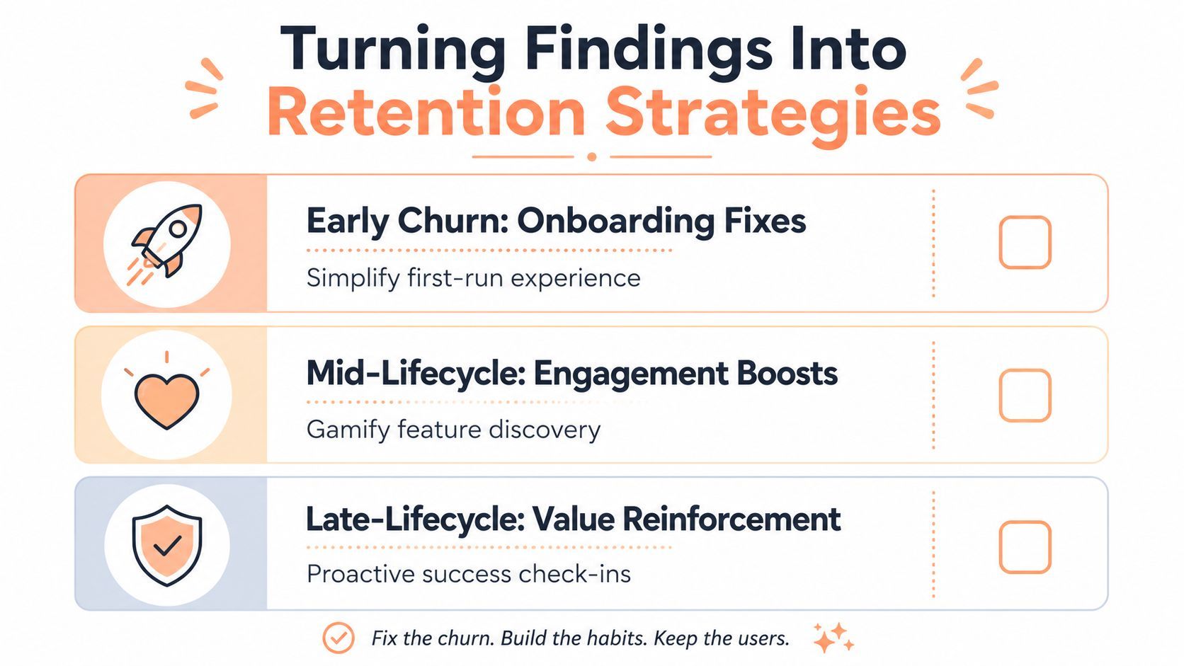
Analysis only matters if it changes what the team does on Monday. The retention moves that usually pay off are the ones matched to the churn mechanism, not the ones that sound proactive. Early churn usually calls for onboarding fixes, mid-cycle drop-off often needs better engagement loops, value-mismatch churn points toward pricing or packaging changes, and involuntary churn needs billing recovery.
Match the intervention to the mechanism
If the cohort problem is early abandonment, simplify the first-run experience and tighten the path to value. If the issue is engagement decay, build better product habit loops and reinforce the use cases that correlate with retention. If the issue is late-stage value doubt, use proactive success check-ins and cancellation feedback to surface the objection before renewal.
The best retention libraries keep this practical. A useful collection of tactical ideas lives in 21 customer retention strategies, but the essential work is choosing the few that map to your actual churn mechanism instead of applying them all at once.
The cleanest teams also test intervention thresholds before rolling out broad saves. That means defining a risk score, holding back a control group, and measuring whether the new process changes renewal behavior rather than just creating more activity. Creem's own discussion of the AI app retention paradox and churn in 2026 sits in that same operational lane, where usage and payment behavior both need to be understood before a fix is chosen.
Practical rule: if you can't describe the churn mechanism in one sentence, you're not ready to pick the fix.
A small indie SaaS can move faster here than a large company. Better cancellation feedback, smarter payment recovery, and one or two targeted onboarding changes can turn a flat retention curve into a more stable one, but only if the team measures the right cohort before and after the change. That's the difference between a retention report and a retention system.
Creem gives software teams one place to handle checkout, subscriptions, tax, and smart payment recovery, which makes churn analysis easier to act on when failed payments or billing friction are part of the problem. If you're debugging retention and want the billing layer to support the fix instead of adding more noise, visit Creem and see how it fits into your stack.