

Table of Contents
- Why Most Business Metrics Dashboards Fail Before They Launch
- Choosing the Right KPIs Using a Decision-First Framework
- Wiring Your Data Sources for Reliability and Speed
- Designing Role-Based Views That Drive Action
- Preventing Metric Drift and Dashboard Sprawl
- Building Your First SaaS Dashboard Template
A widely cited benchmark puts active BI and dashboard usage at around 29%, even while 87% of organizations report increased analytics adoption (Business Analysis). The uncomfortable conclusion is that most companies don't have a data-access problem. They have a business metrics dashboard adoption problem. People can't act on a dashboard they don't trust, can't understand, or can't connect to a decision they own.
The gap becomes more consequential as dashboards move into daily operations. One industry compilation reports that enterprise dashboard adoption reached 67% in 2023, up from 52% in 2020, while mobile sessions accounted for 45% of total dashboard sessions in 2023 (International Journal of Business and Economic Insights). The capability is becoming standard. The operating discipline still isn't.
Why Most Business Metrics Dashboards Fail Before They Launch
The dashboard usually fails before the first chart is drawn. Teams start with available data, choose attractive visualizations, and ask users to discover the value afterward. That reverses the actual sequence. A dashboard creates value only when the intended user opens it, interprets the signal correctly, and takes an action.
The 29% active-usage benchmark matters because it shows how easily dashboard investment can stop at deployment (Business Analysis). If more than two-thirds of intended users aren't engaging regularly, adding another chart won't solve the problem. The failure sits in adoption, governance, training, or KPI design.
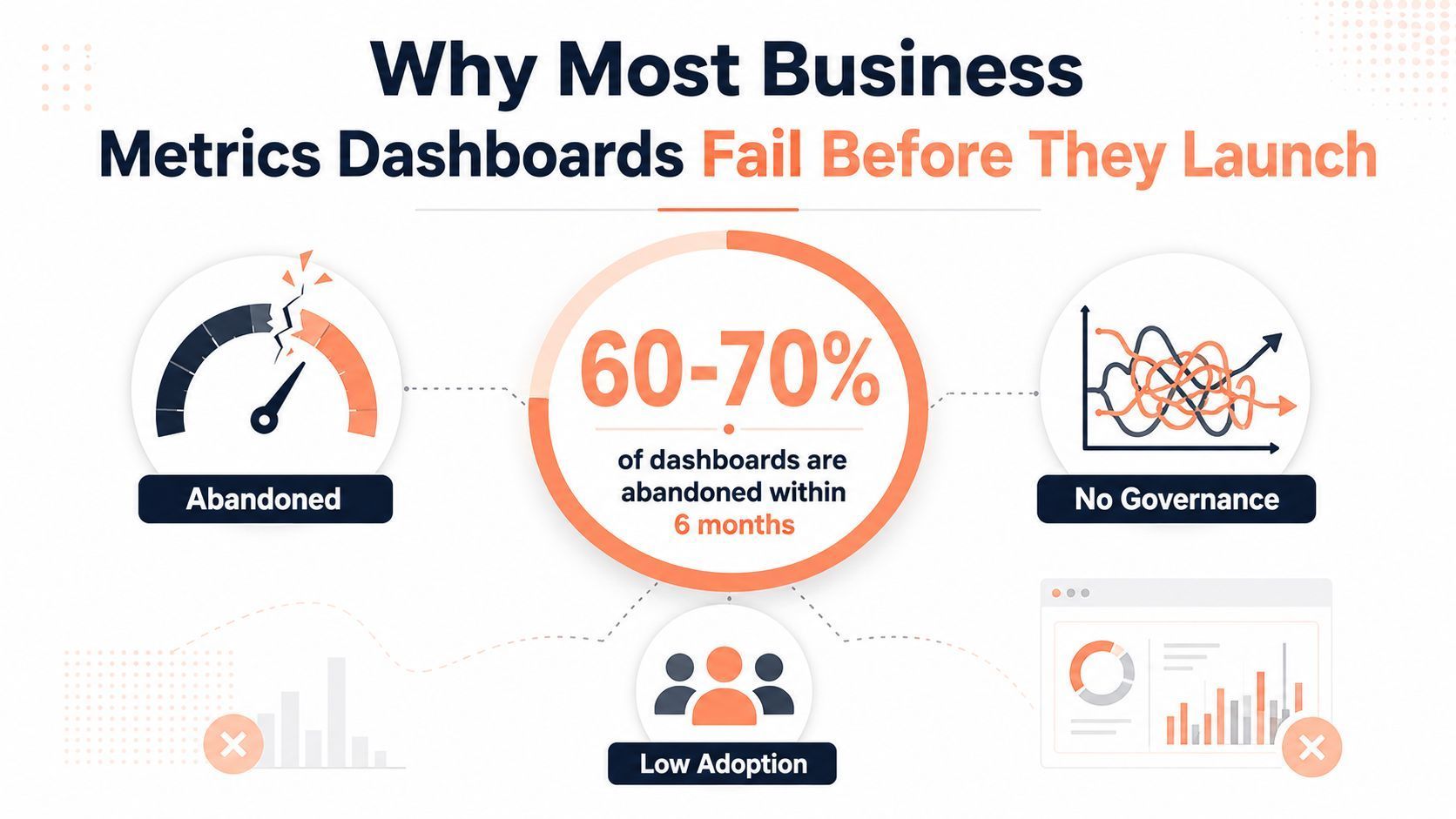
The three silent killers
Inconsistent definitions create the first fracture. Marketing may define a qualified lead by intent and behavior, while Sales uses a later qualification stage. Product may call someone active after a single meaningful event, while Finance counts only paying accounts. Each team can have a technically correct dashboard and still disagree in the planning meeting.
Decision latency creates the second. A report that explains last month's revenue may help with review, but it won't necessarily tell a sales manager which deals need attention today. Recent dashboard guidance increasingly emphasizes analytics inside workflow apps, spreadsheets, chat, and embedded product experiences rather than a standalone view (Improvado). The practical lesson is simple: a useful dashboard should shorten the distance between a signal and an owned response.
Role-agnostic design creates the third. An executive needs direction, variance, and risk. A RevOps manager needs segmentation and drill-downs. A customer success manager needs an account queue. Putting all three needs on one screen creates a crowded compromise that satisfies none of them.
Operating principle: A dashboard is successful when it increases decision velocity, not when it contains more data.
Treat the business metrics dashboard as an operating interface. Before discussing layouts, it helps to review financial dashboard samples to see how different audiences can receive different levels of financial context. The point isn't to copy a visual style. It's to ask what a user should understand immediately, what they should investigate next, and what action should follow.
Choosing the Right KPIs Using a Decision-First Framework
Start with the decision, not the database. A KPI earns a place on a business metrics dashboard only when a specific person can use it to choose, prioritize, approve, investigate, or intervene.
A practical sequence looks like this:
-
Name the decision. “Should we hire another account executive?” is actionable. “How is sales performing?” isn't precise enough.
-
Assign the owner. Identify the person who can change the outcome. If nobody owns the decision, the metric will become observation rather than management.
-
Set the action cadence. A pipeline manager may need intraday updates. A CFO may need a reconciled period view. A product leader may review cohort movement around launches.
-
Select the smallest useful KPI set. Guidance recommends roughly 5–7 KPIs for managers and 3–5 for executives (Tsunami Digital). Use supporting metrics behind drill-downs instead of placing every available measure on the summary screen.
-
Add context. A number without a target, prior period, segment, or trend can mislead. Every headline KPI needs a clear comparison.
Consider the sales hiring decision. Raw lead volume may look encouraging, but it doesn't answer whether additional capacity is justified. Pipeline coverage, win-rate movement, sales-cycle behavior, and current rep capacity are closer to the decision. The same underlying CRM data becomes useful only after it's filtered through the decision owner's responsibility.
Leading and lagging indicators should sit together, but they shouldn't be treated as equally certain. Pipeline is directional and can change. Closed revenue is more final but arrives later. A strong dashboard labels the difference so users don't mistake a forecast signal for an accounting result.
A decision map for SaaS teams
| Role | Key Decision | Action Cadence | Primary KPIs | Data Source |
|---|---|---|---|---|
| Head of Product | Which product behavior needs intervention? | Weekly or around releases | Activation event completion, feature adoption, cohort retention | Product analytics and event data |
| CFO | Are growth and cash performance aligned with the plan? | Monthly or during forecast reviews | Revenue movement, gross margin, cash position, forecast variance | Billing, accounting, and bank systems |
| Customer Success Lead | Which accounts need intervention? | Daily or weekly | Product engagement, renewal status, support activity, account risk | Product analytics, CRM, and support platform |
| VP of Sales | Should capacity, territory, or deal support change? | Weekly and intraday for active deals | Pipeline coverage, win-rate trend, stage conversion, sales-cycle movement | CRM and billing systems |
Subscription businesses also need consistent definitions for recurring revenue. A useful reference for the mechanics is ARR calculation guidance for subscription businesses, particularly when Finance, Sales, and Product are using different source systems.
The dashboard summary should make the primary number obvious quickly. The referenced design guidance recommends a 5-second comprehension rule and separate role-based views (Tsunami Digital). That doesn't mean every dashboard needs to be visually minimal. It means complexity should be available on demand, not imposed before the user knows what requires attention.
Wiring Your Data Sources for Reliability and Speed
A trustworthy business metrics dashboard starts with a reliable path from source system to decision view. In a typical SaaS environment, Stripe may hold transaction and subscription events, HubSpot may contain marketing and pipeline activity, Mixpanel may capture product behavior, and Zendesk may hold support interactions. Those systems don't share definitions automatically, and they rarely update on the same schedule.
Manual CSV exports feel flexible at first. They also create repeated opportunities for missed rows, inconsistent filters, changed column names, duplicated records, and undocumented spreadsheet logic. Once a number is challenged, the team has to reconstruct who exported what, when the export happened, and which formulas changed.
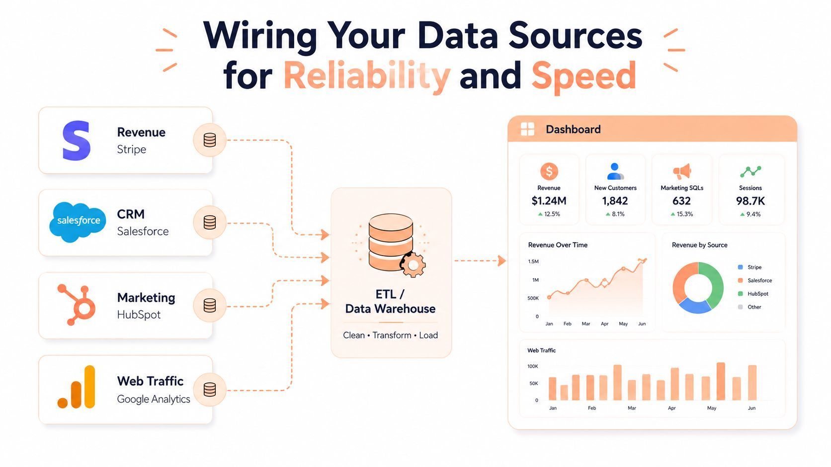
Choose the pipeline around the decision
Native integrations can work well when a dashboard depends on one platform or a small number of stable sources. ETL tools such as Fivetran and Stitch become useful when teams need repeatable extraction from several systems. A warehouse such as Snowflake or BigQuery provides a central place to clean, join, test, and document data before a reporting layer consumes it.
The architectural choice matters less than the ownership model. Every important metric needs a named business owner, a technical owner, a source-of-truth table, a refresh expectation, and a process for handling changes. Guidance on sales dashboard reliability highlights automated connections, clear data ownership, data-quality controls, role-specific dashboards, and periodic review of stale KPIs (Improvado).
Refresh speed should match the decision. Sales managers may need current pipeline movement during the working day. Finance may prefer a slower, reconciled view for recognized revenue and period close. Product teams may need recent event data during a launch, while an executive trend view can tolerate a scheduled refresh if the underlying period is stable.
A real-time label also needs discipline. If upstream events arrive late, identities don't resolve, or refunds post on a different schedule, a fast refresh can deliver a fast wrong answer. Put freshness and completeness indicators beside sensitive metrics, and show the last successful load rather than hiding it.
Ownership rule: If nobody is accountable for a broken metric, the dashboard isn't governed. It's merely connected.
Build the definition layer before the chart layer
Create a data dictionary that records each KPI's name, formula, inclusions, exclusions, time zone, currency treatment, source, owner, and approved use cases. Document whether “customer” means an account, a subscription, or a paying entity. Record which event marks activation and which cancellation date controls churn.
This also applies outside SaaS. If you're assembling external market inputs, a workflow such as a realestate.com.au property data scraper still needs validation, field mapping, provenance, and an owner before those records become dashboard inputs. Extraction is not governance.
For subscription revenue, reconciliation deserves its own process. Teams can use this practical revenue reconciliation guide for software teams as a reference point when connecting billing activity, invoices, refunds, credits, and accounting records. The dashboard should expose exceptions instead of smoothing them away.
Designing Role-Based Views That Drive Action
The same metric can support three different decisions. Net revenue retention, for example, might appear as a board-level trend for the CFO, a segmented cohort analysis for RevOps, and an account-risk queue for a customer success manager. The underlying value is related, but the presentation and next action aren't.
A board-ready view should answer whether the business is moving toward its plan. It needs a small number of prominent KPIs, trend direction, variance, and a clear indication of where leadership attention is required. Operational users need filters, segmentation, and drill-downs. Individual contributors need worklists, alerts, and account or deal context.
One metric, three operating interfaces
For the CFO, net revenue retention could be a headline card with a historical trend and variance to plan. The CFO doesn't need every account on the opening screen. They need confidence that the number reconciles and a path to investigate the drivers.
For RevOps, the same measure could be segmented by plan, acquisition channel, customer size, or cohort. The question is no longer “what is retention?” It's “which segment is changing, and which commercial or product behavior explains the movement?”
For a CSM, the useful output is an at-risk account list. A declining usage pattern, unresolved support activity, or renewal proximity can trigger a review. The CSM needs enough context to act, not a heatmap that requires further manual assembly.
| Role | Primary Metrics | Visualization Style | Refresh Cadence | Decision Trigger |
|---|---|---|---|---|
| Executive | Revenue movement, retention, margin, plan variance | Headline cards, trend lines, variance indicators | Scheduled and reconciled | Escalation, reforecast, or resource shift |
| Operational manager | Funnel movement, cohorts, capacity, segment performance | Tables, drill-downs, cohort views, filters | Frequent operational refresh | Process change, coaching, or prioritization |
| Sales or CS contributor | Active deals, account risk, tasks, recent activity | Action queues, alerts, concise account panels | Current working-day data | Contact, follow-up, intervention, or escalation |
The danger is the universal dashboard. It usually grows through compromise: Finance asks for another card, Sales adds another filter, Product requests a cohort view, and the opening screen becomes a catalogue of unresolved priorities. Dashboard design guidance identifies clutter, mixed audiences, and missing context as common pitfalls (Tsunami Digital).
Monitoring versus decision views
A monitoring dashboard helps someone notice a change. A decision dashboard helps them determine what to do next. Monitoring is appropriate for infrastructure health, payment failures, or a support queue. Decision views need thresholds, ownership, context, and an action path.
Filter architecture matters as much as chart choice. Put high-value filters near the top, preserve sensible defaults, and ensure filters don't alter definitions. A sales manager should be able to move from regional pipeline to individual deals without losing the period, currency, or stage logic that made the headline meaningful.
A practical retention reference is this guide to customer analytics, retention, and revenue. Use it to sharpen the questions behind the view, then design the screen around the user who must answer them.
Preventing Metric Drift and Dashboard Sprawl
Dashboard utility degrades through a predictable chain. A definition changes without documentation. A team builds a local version to compensate. Other teams see conflicting numbers and create their own versions. Soon the organization has several dashboards, multiple formulas, and no trusted answer.
Self-service analytics can accelerate that problem. Coverage of enterprise analytics sprawl describes how competing dashboards create confusion, duplicate tooling costs, and trust issues when teams don't resolve definitions at the dashboard layer (TechTarget). The answer isn't to ban local analysis. It's to distinguish governed metrics from exploratory work.
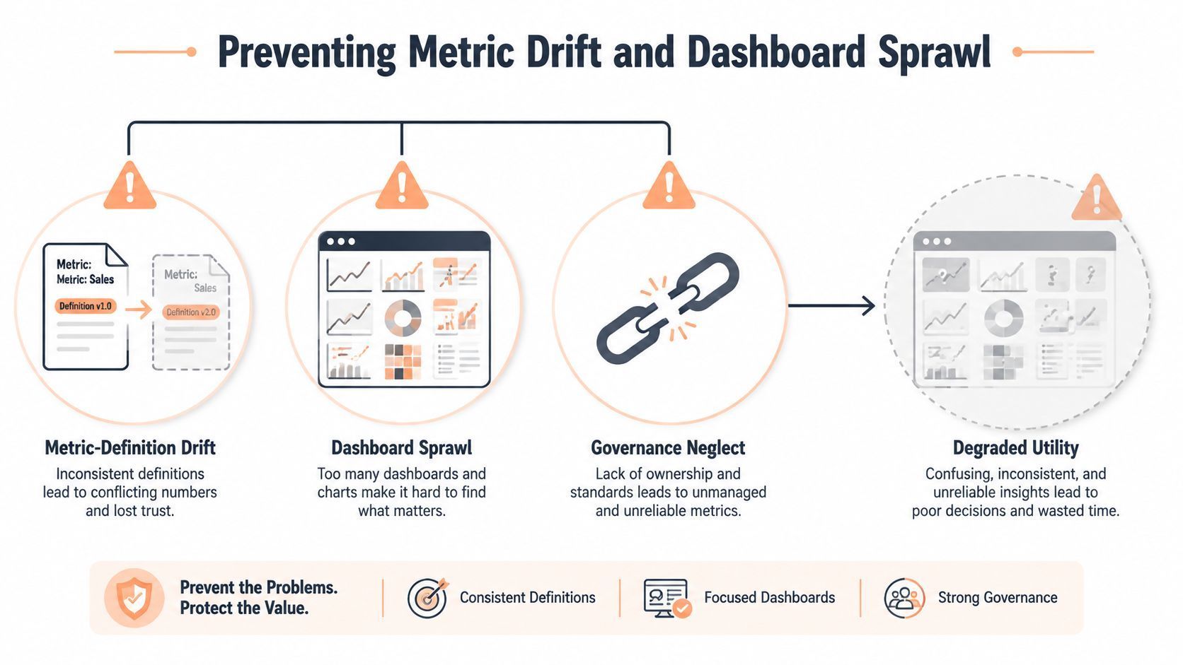
Govern the definition before the interface
A metric catalogue should contain one approved definition for each shared KPI, along with its owner, source, refresh expectation, and change history. If Product changes the activation event, the catalogue should record the effective date and identify which historical values can be compared safely.
Assign ownership at two levels:
-
Business owner: Decides what the metric means and how the team uses it.
-
Data owner: Maintains the pipeline, tests, permissions, and freshness.
-
Dashboard owner: Maintains the view, labels, filters, and user feedback loop.
Audit dashboards against actual usage and business decisions. Retire views that no longer answer an active question, remove KPIs without owners, and investigate repeated exports or local spreadsheet workarounds. Those behaviors often indicate that the official view is missing context or arriving too late.
Governance test: If two teams use the same KPI to make different decisions, either the definition or the segmentation is incomplete.
Central hub or embedded workflow
A centralized dashboard hub works well for strategic review, cross-functional planning, and governed definitions. Embedded analytics works better when users need the signal inside the workflow where action happens, such as a CRM record, support queue, product interface, or team chat.
The choice depends on the decision. Keep the canonical metric in a governed layer, then distribute approved outputs into the tools where people work. Alerts and thresholds can reduce decision latency, but only if recipients know what the alert means and what action they own.
Sprawl isn't solved by creating one giant dashboard. It's solved by maintaining a clear source of truth, publishing role-specific views, and giving teams a controlled way to explore questions without redefining shared metrics.
Building Your First SaaS Dashboard Template
A useful first build starts with interviews, not wireframes. Ask each stakeholder which decisions they make, which numbers they currently trust, where they reconcile manually, and what they do when a metric moves unexpectedly. Those conversations usually expose definition conflicts before engineering work makes them expensive.
A Series B SaaS team might discover that Finance treats a paying customer as an invoiced account, Sales counts signed contracts, and Product counts active workspaces. The first deliverable shouldn't be a polished dashboard. It should be a decision map and a definition register that forces those differences into the open.
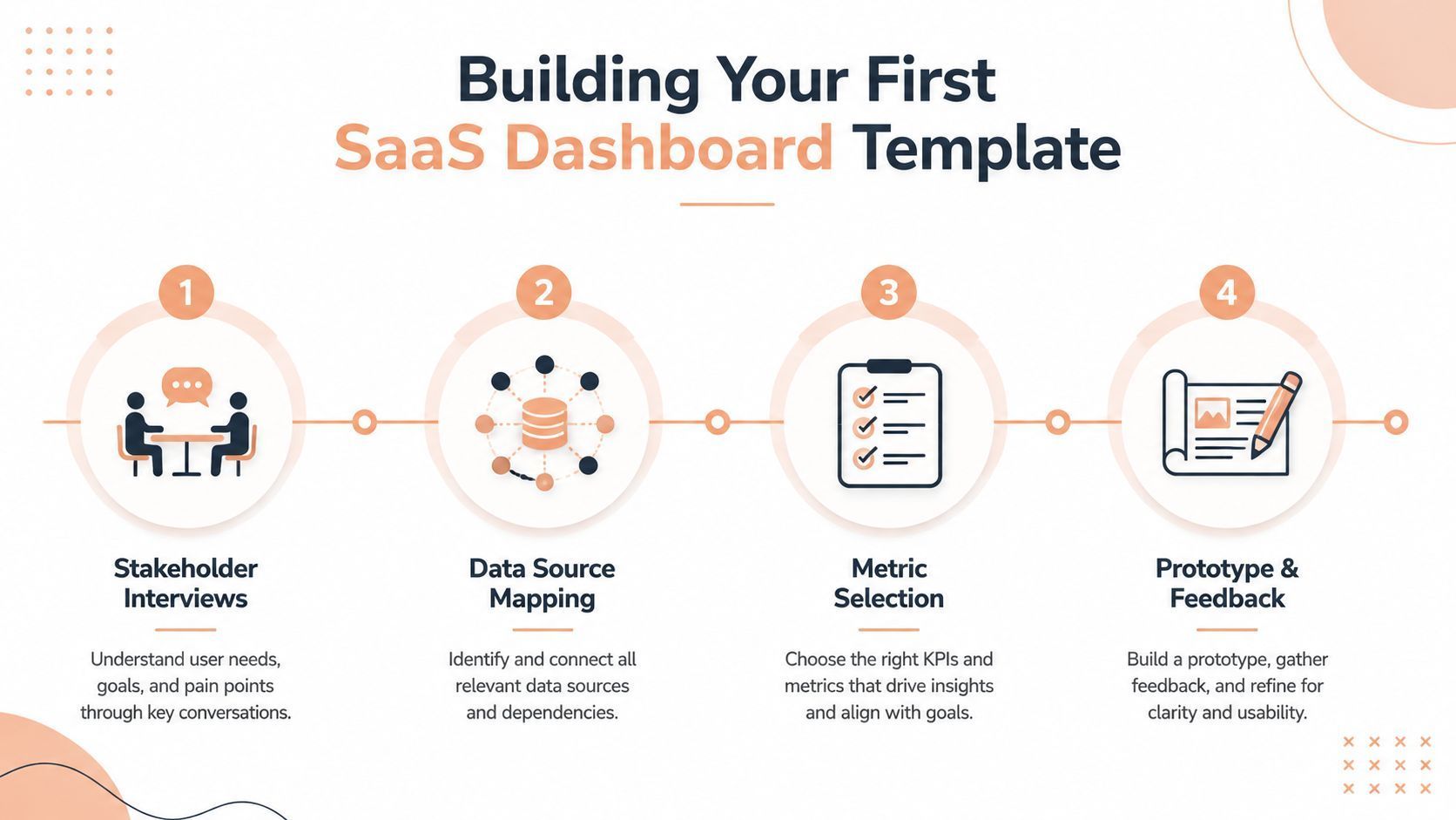
A practical build sequence
Interview the owners. Speak with Finance, Sales, Product, Growth, and Customer Success. Capture the decision, owner, cadence, current source, and known disagreement for each important KPI.
Map the sources. Connect billing, CRM, product analytics, support, and accounting inputs. Record which system owns each field and where transformations occur. Don't hide manual adjustments. Label them and assign responsibility.
Select the first view. Keep the executive summary deliberately narrow, then create separate operational views. A first version should answer real questions, not demonstrate how many charts the BI tool can render.
Prototype with users. Put the draft in front of the people who'll act on it. Ask them to identify the next action from each important signal. If they can't, the view needs better context, clearer ownership, or a different KPI.
Iterate based on behavior
After launch, review more than login counts. Look at filter usage, exports, drill-down behavior, alert responses, and whether meetings spend less time debating definitions. A frequently exported view may be valuable, or it may reveal that the dashboard is missing a reusable workflow.
Treat the first ninety days as an operating experiment rather than a finished implementation. A sales leader may reveal that the initial view lacks pipeline coverage. Product may discover that its adoption chart tracks an event that doesn't represent meaningful activation. Customer Success may need account-level risk context instead of an aggregate retention curve.
A three-tier structure often creates a workable balance:
-
Executive layer: A concise view of direction, plan variance, revenue, retention, and financial health.
-
Functional layer: Department-specific analysis for pipeline, product cohorts, customer health, or finance reconciliation.
-
Action layer: Deal queues, account alerts, payment exceptions, support tasks, and other items that require immediate ownership.
For software companies that need commerce data alongside operating metrics, Creem provides merchant-of-record payments, subscription billing, tax handling, revenue splits, affiliate tooling, and store metrics that can be connected to broader reporting workflows. Visit Creem to evaluate how its billing and revenue data could fit into your business metrics dashboard. Start by documenting the decisions and definitions your team needs, then build only the views that help people act on them.